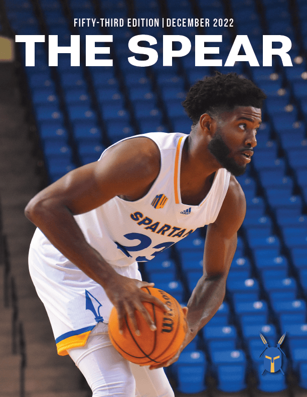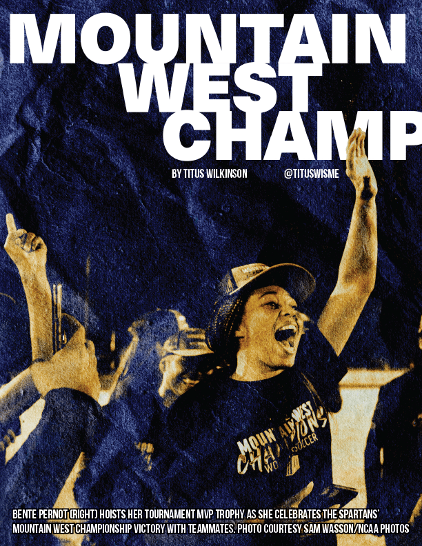
Design Overview:
This was my introduction to designing for THE SPEAR. I delved into experimenting with textures, type, and colors in this issue, elements that later became a staple in the design language for future issues and Instagram graphics. For my spreads in the issue, I aimed to give each cover story typography a strong sense of motion, achieved by altering the leading and arrangement of type.
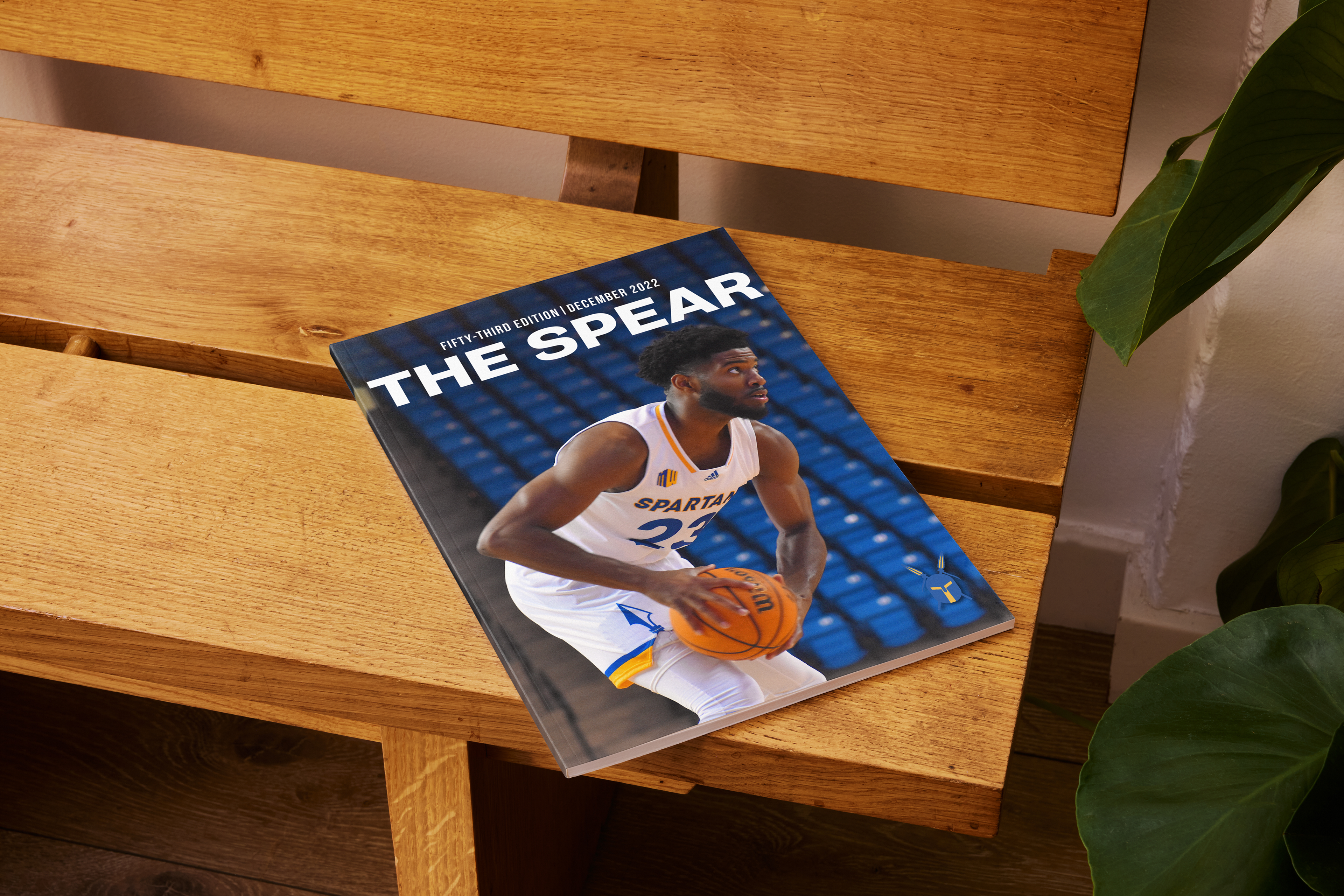

The following are pages I designed for THE SPEAR magazine.