Overview:
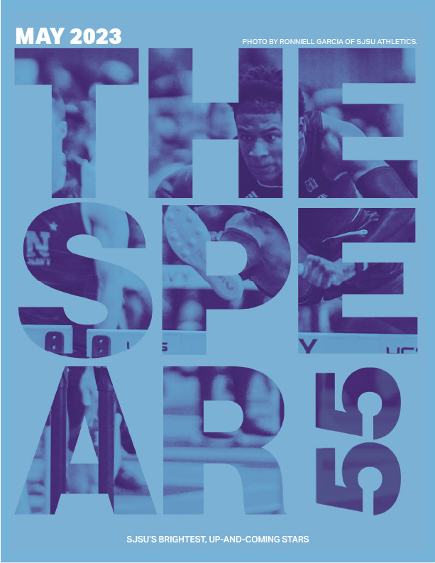
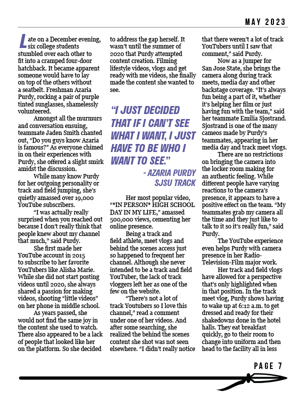
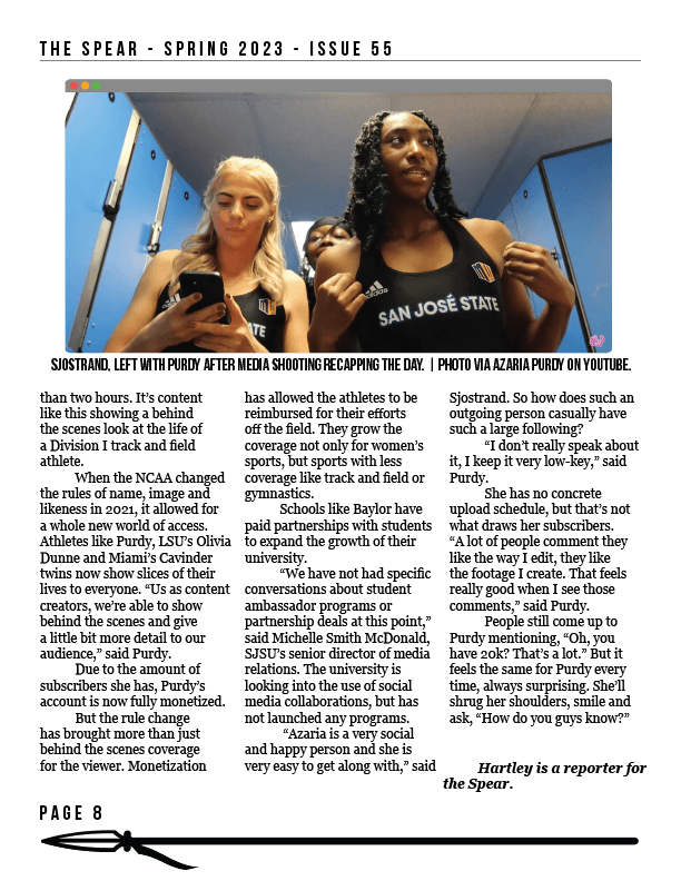
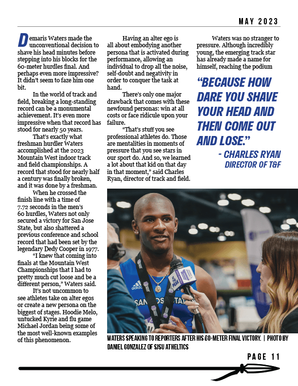
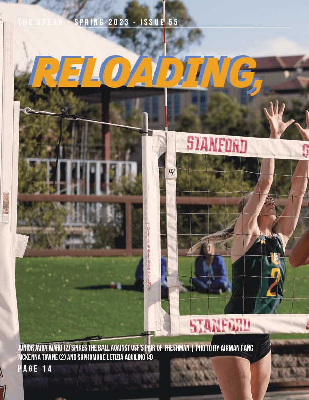
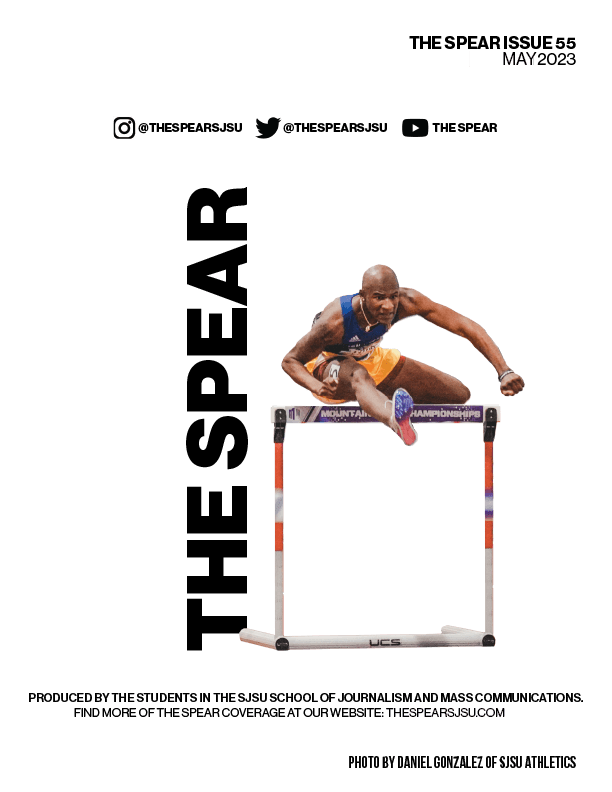
This issue maintains continuity with the previous one, establishing a visual language between the two. One of my visions for this magazine was to blend editorial and sports styles. I aimed for attention-grabbing covers for issues 55 and 54 that would also complement each other when displayed on a table or shelf. The magazine's contents follow my system of using halftone backgrounds and gradient maps, allowing main subjects to stand out while visually representing our school's spirit.
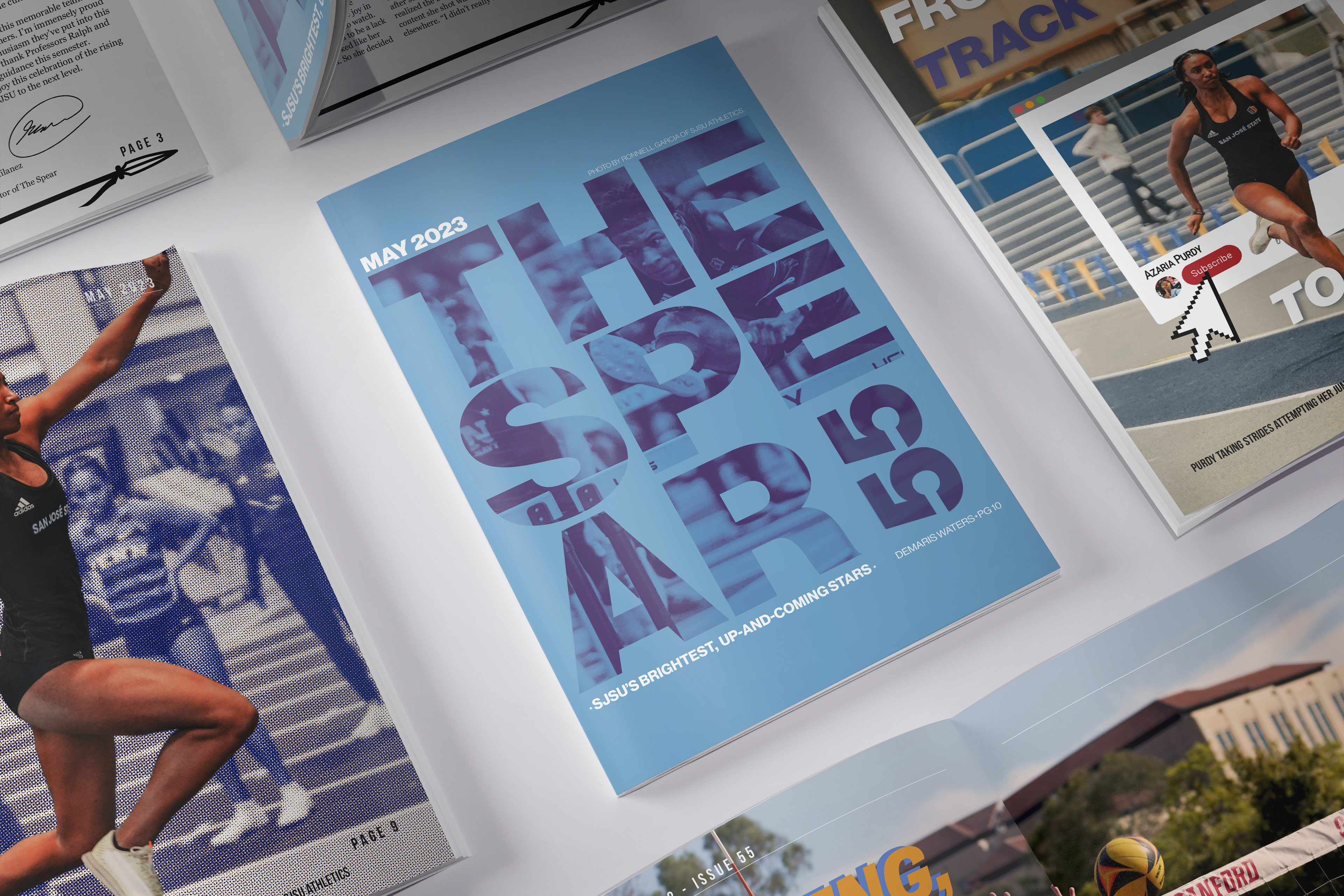

The following are pages I designed for THE SPEAR magazine.
